|
|
GenePaul Professional
|
Portfolio
|
|
The following projects reflect the
work I've done as a student at DePaul, and on my own. Just click
on the image to open a description and full presentation of each
piece in a new window. Close the window to get back here.
|
| |
|
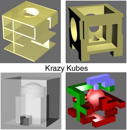
This is a new addition. The assignment was to take a basic cube, then take penetrating
extractions from it in different ways. One was to create a cave within the cube,
another to create a maze within the confines of the cube, another was to use only
planar elements (walls and floors), and still another was to take different extractions, creating spaces within spaces.
Used Rhino 3D.
|
| |
|
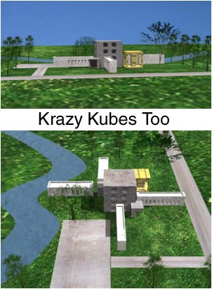
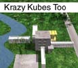
This is the second incarnation of the previous assignment. We were given a site, and
had to create a proportional sequence of rectilinear masses, then give them the appearance
of buildings (though not incredibly accurate). Used Rhino 3D, 3D Studio Max and Photoshop.
|
| |
|
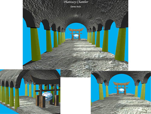
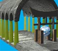
This project was called "Phantasy Chamber." We had to take three different architectureal motifs
and combine them in a single chamber in some way. I chose the columns of a greek temple, the barrel
vault of gothic style, and the tori gate of Japanese architecture. Don't ask about the sphere, it's
part of the "phantasy." Used Rhino 3D, 3D Studio Max, and Photoshop.
|
| |
|
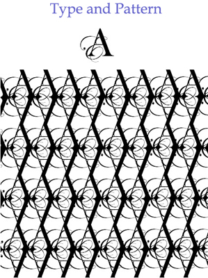
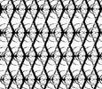
I created this for my Principles of 2D Design class. We had to take the first letters of our first and last names,
and create a unified graphic. Then we turned this graphic into a repeatable pattern. You'll notice that I've used
this icon as my personal logo, because I like how it looks.
|
| |
|
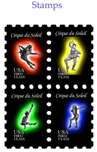
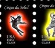
This was also created for Principles of 2D Design. We were told to create a set of four stamps, using the theme of the circus,
and to unify them. I used icons representing the Cirque du Soleil, and used variations in color, with the black background as
the unifying element.
|
| |
|
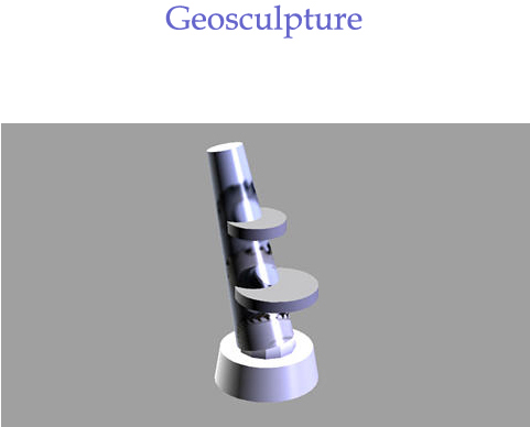
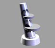
This project was for my Principles of 3D Design class. We needed to extract primitive shapes (sphere, cone, cylinder, cube) from an
ordinary object, and reconfigure them to create a unique sculpture. This sculpture is unbalanced by its off-kilter positioning, but
it does stand up (I created a paper version of it), due to the balancing discs.
|
| |

|
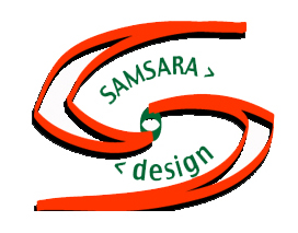
This logo was one I created for a website design company that I am planning on starting in the future, called Samsara Design. The
whole idea of the company, as well as the logo, comes from the meaning of the word Samsara: the neverending cycle of birth, life,
death, and rebirth. I believe the design process is much like this, as it is cyclical.
|
| |
|
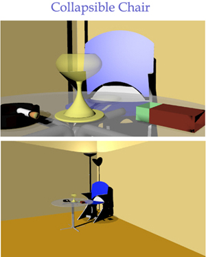
This chair was created for my Digital Modeling class. We designed a chair, taking into account ergonomic design. The chair should
also be collapsible and easily stored. Mine comes apart, and would store in a container of some sort that could
be put in the back of a closet. The design derives from the Star Trek logo - I guess I was feeling space-age at the time.
|
| |

|
This project was done for the website of Stuart Davis, a folk musician from
Minnesota. The idea was never implemented, but the basic thought was to have a way for people to hear clips of his songs, and see
information on them. It was also a personal exercise in Flash preloaders (it's not a big movie, so you probably won't even see the
preloader), and in incorporating sound.
|
| |
|
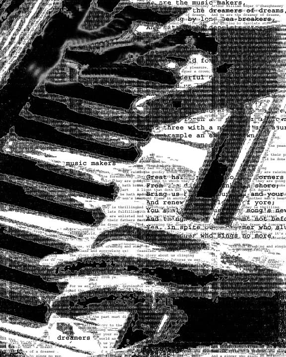
This piece was done for my 2D Design class. We had to take an existing photographic image, and substitute varying levels of text,
thus recreating the image entirely from text. I used the poem, "We are the Music Makers, We are the Dreamers of Dreams," by
Arthur O'Shaughnessy, as the text.
|
| Copyright © 2003, Gene
Paul Arch. All rights Reserved. | |
|
|
|