![]()
![]()
![]()
![]()
![]()
![]()

![]()
|
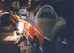
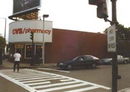
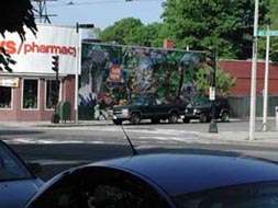
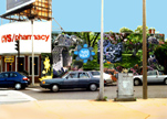
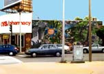
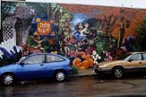
All paintings created by Off the Wall Murals are original works of art and bear the unmistakable mark of artist George Ratkevich. The style and method with which each mural is made, however, may be influenced by factors as varied as the purpose of the painting, its location, climate, and the tastes and needs of the client. Photography and computer graphics played a large role in both the Flanagan and Seaton automobile series and the Petal &Leaf mural. In both cases, several days were spent taking photographs as the basis for the designs. These images were then combined and digitally manipulated. Compositional and color variations were made for each painting, and, once approved by the client, they were transferred to the painting surface. In the series of paintings created for Flanagan and Seaton Motorcar Company, slides were made of the printed designs, which were projected onto aluminum sheets. In this series, George worked with oil-based enamel paints on the metal panels. Because the artist was able to work in his studio, he was unconcerned with climatic conditions (the paintings were made in late autumn). The nine panels were installed in a few hours one Saturday morning, avoiding any disruption to regular business at the showroom. Since the paintings were commissioned to draw the attention of passing motorists from a distance, they are simple in composition and direct. A high level of detail was unnecessary. High contrast between the subject (automobile) and the background was essential, as was bold color. Since the client wanted to present a very specific image, the designs underwent numerous incarnations before they were painted. A "lightness of being" was the intended effect of The Dance, which moves across all four walls of a dining room. It was made largely through improvisation. A series of loose and energetic drawings were made in advance to work out general visual ideas related to the theme, and they were referred to briefly in the beginning stages of the wall painting. The lively quality of the drawing was maintained throughout the painting, and a limited palette was used to keep the mural unified and integrated with the room itself. A beautiful Prussian Blue was used as the primary color, with accents of green and sienna throughout. The mural was made with oil paints, which have a slow drying time, and the tones were created by wiping away the color for highlights. The following illustrates the steps taken during the early stages of the Petal & Leaf mural, which was designed to bring attention to a flower shop that leased a space from a larger store. Since their own sign loomed above the much smaller flower shop,the larger company agreed to signage for Petal & Leaf on one of the walls of their building. In addition to its commercial purpose, the mural would connect to the neighborhood both visually and in spirit, and was meant by the artist to be a welcome sign or gateway to this part of Boston.
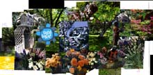
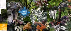
The artist and client discussed their ideas, and came to an agreement about the theme and general design for the mural. After taking photographs of the grand homes of the area, in the nearby Arnold Arboretum, and inside the flower shop, George pasted together a photomontage, taking into consideration the flow of the composition and points of emphasis. He included the shop's logo and added characters from an unused CD cover he had previously designed.
The artist tested the design in a computer-manipulated image, which was presented to the client as a rough draft. The client asked for a change of color to the logo to set it off against the rest of the painting, and gave the go-ahead to continue.
George drew additional figures for the composition. A sense of playfulness and vitality were brought to the design through the activity and expressiveness of the characters.
Tonal value was added in more refined drawings, melding the caricatured figures with their photographic environment. It was decided to keep the figures rather monochromatic and neutral in color. Except for a minor change to the logo, the design was complete.
Another digital test was made with the final design.
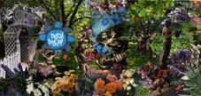
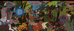
The composition was broken down into simpler shapes and a more general color scheme for the first stages of actual painting. It was resized and gridded with a scale of 1 inch:1 foot.
The lines within each grid square were transcribed to the wall with chalk, and painting began. The image below illustrates the various stages of painting: the grid lines and outlines in the upper right corner; the broad areas of color in the lower right, and the more refined painting on the left side of the wall.
Exterior latex paint was used on the primed brick wall, and the mural was later coated with two layers of MSA UV-protective varnish to withstand the New England elements.
|
![]()
![]()
![]()
![]()
![]()
![]()